The final variation, Font-On-A-Stick.
I thought it might be fun to get feedback on this rather than just up and change it all myself. Even though Zeta told me I shouldn't change ANYTHING, I'd like to mix the template around a bit for when TVGCS returns later this year.
For starters, our panels are more... normal in size. Up 'til now, they've been something like 256x154, which is a really odd number, and was entirely my fault. Taking a bit of a cue from Linko (Linko Man, not personally from Linko himself), I think it'd work better if they were more equal in proportion, so now the panels are 200x150.
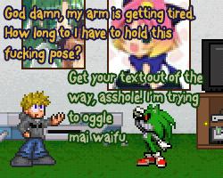
[IMG]http://i182.photobucket.com/albums/x65/Dystorce/TVGCS4Test.png[/IMG]
As you can see, pretty much everything is basically the same, except for a few things.
1) The "headlines" are now stuck in an expanded footer.
2) The "Created by Chris and Dan" thing is removed. You guys know **** well who's making this crap by now.
3) Possibly the biggest change, a new dialogue font!
That third one is the only one I'm not TOTALLY convinced on. I'd like feedback on it, so be sure you vote. Here are the possible candidates for new fonts that I've found.
[IMG]http://i182.photobucket.com/albums/x65/Dystorce/NewFonts.jpg[/IMG]
If you see anything wrong or have anything to pitch in, please do.
Part of me wants to keep Verdana, because we never had to fool with antialiasing on it, but then again, part of me wants to try something new... So vote! You could very well make the decision for me.
The one in the layout comic looks alright. If not a smidge too big. otherwise, yeah. basically the same :cool:
I like Kronika.
I like the one in the comic example as well. But I might add that the text in the footer seems unusually big.
I could knock it down a little. Not a big deal.
I agree with The X
I like the one used in the sample comic. =)
Kronika or GosmickSans as well. Italics are stupid and the other one doesn't really look comic-y.
That one's not italic. At least, I didn't choose italic for it.
There's one more font I liked that I forgot about... I might show it later.
The font in the example is that big because any smaller and it seems a little... thin.
Sorry, I don't know why this one slipped my mind.
The final variation, Font-On-A-Stick.
Like I said over AIM, it's good. Possibly the best yet.
I wasn't sure about the last sample, but the longer I look at it, the more I like it. o.O; It's brainwashing meeee~! >.<
And you will hold that pose as long as it **** well takes. :3
By the way, where do you get your fonts? O.o
Usually from [url=http://www.dafont.com/]DaFont[/url].
TVGCS Logo: Daniel Black
Episode Titles: Lazy Dog
New footer text: Ampersand
Oh yeah. Thank you. =) I kinda forgot about daFont. =^^= Y'd think I'd have it bookmark'd somewhere, but I don't. =/ (EDIT:: Didn't. NOW I do. =D) I had to go looking, so I've been using [url=http://www.urbanfonts.com/free-fonts.htm]UrbanFonts[/url]. Which probably has all the same fonts daFont does. ^^;
EDIT (the 2nd):: Also, [url=http://blambot.com/fonts.shtml]BlamBot.[/url] Doesn't have as many, and they're not all free, but the free fonts they do have are good. =)