alright.
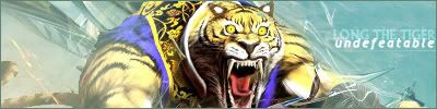
Posted by RoXas/eh, alright, I like making sigs whenever I have some freetime, so I make like, maybe a few a week. anyways, I figured id just show you some, their mostly absract, with a gaming stock/render.
now, im not sure how much you guys know about abstract and everything, so if you dont like it, then meh. what can I say..
anyways, heres two galleries.
http://s29.photobucket.com/albums/c276/r3dzgf/tag/
tags(sigs)
http://s29.photobucket.com/albums/c276/r3dzgf/Banners/
banners, mostly all for my site.
tell me what you think.
heres the link to my main photobucket page, if the others dont work..
http://s29.photobucket.com/albums/c276/r3dzgf/
Posted by NightmareBassX
Quoting RoXas/: eh, alright, I like making sigs whenever I have some freetime, so I make like, maybe a few a week. anyways, I figured id just show you some, their mostly absract, with a gaming stock/render.
now, im not sure how much you guys know about abstract and everything, so if you dont like it, then meh. what can I say..
anyways, heres two galleries.
http://s29.photobucket.com/albums/c276/r3dzgf/tag/
tags(sigs)
http://s29.photobucket.com/albums/c276/r3dzgf/Banners/
banners, mostly all for my site.
tell me what you think.
heres the link to my main photobucket page, if the others dont work..
http://s29.photobucket.com/albums/c276/r3dzgf/
I like alot of them. They are pretty nice. Im trying to learn how to use the PS CS2 trial version, I want full, but have no serial number. Good work, though.
In one of them, Its a naruto Banner with Sasuke in it, yet its labeled Itachi, why is that?
Posted by Azure WolfDems is purdy
Posted by RoXas/
Quoting NightmareBassX:
In one of them, Its a naruto Banner with Sasuke in it, yet its labeled Itachi, why is that?
a guy was like, make a naruto sig, but in all honesty, I really didnt know a thing about naruto.
Posted by NightmareBassX
Quoting RoXas/: a guy was like, make a naruto sig, but in all honesty, I really didnt know a thing about naruto.
Oh, I see. You were close, Itachi is Sasuke's brother. :)
Posted by Velvet NightmareThe "Destorys" concept is what caught my eye. It's quite flush, the airy feel is quite good, and I like the oversaturation. Good job.
Posted by AlastorI really like just about all of them. Very nice. My favorite's gotta be the Samus one. :cool:
Posted by KlarthThey're pretty good, but they all look very... Samey. Also, not to be offensive or anything (because I'm guilty of this sometimes), but it looks like a good deal of the backgrounds for the banners are renders you took from somewhere else. Looks good, but when someone spies their work in your banner, they're not pleased. It happened to me a year ago or so, so I had to cut down quite a bit :/
Brushing is also nice, but at least you don't go overboard on blatant filters/blending options. Add a little more variation - Otherwise they're pretty fabulous. :D
I like that one the best simply because of the abstract/plasma blending you used around the right side. Makes a change to the lazy dodging and burning I did in my own sig.
Posted by RoXas/yeh, thanks.
though the only thing I use from other people is the C4D, which was in packs, which i got permission for =D